
A css color gradient is a smooth transition between two or more colors rendered entirely in the browser, with no image file required. That single fact makes gradients one of the most practical tools in a front-end developer's toolkit. They reduce HTTP requests, scale perfectly at any resolution, and can be updated with a single line of code. Whether you are styling a call-to-action button, building a full-page hero background, or adding depth to a card component, understanding how CSS gradients work gives you precise control over every pixel of that transition.
Content Table
Key Takeaways:
- CSS offers four gradient types: linear, radial, conic, and repeating variants of each.
- Gradients are applied as
background-imagevalues, notbackground-color, which matters for fallbacks. - Conic gradients are widely supported but still underused, making them a quick differentiator in UI design.
- Always declare a solid
background-colorfallback before any gradient rule for graceful degradation.
Linear Gradients Explained
The linear gradient css function draws a color transition along a straight line. The basic syntax looks like this:
background-image: linear-gradient(direction, color-stop1, color-stop2, ...);The direction parameter controls the gradient direction css. You can use keyword values such as to right, to bottom left, or an angle in degrees like 135deg. When no direction is specified, the default is to bottom (top to bottom, 180 degrees).
Color stops give you fine-grained control. Each stop can include an optional position:
/* Two-color, left to right */
background-image: linear-gradient(to right, #6a11cb, #2575fc);

/* Three-color with explicit positions */
background-image: linear-gradient(135deg, #f093fb 0%, #f5576c 50%, #fda085 100%);
Adding a percentage position to each stop lets you create hard edges (set two stops at the same position) or compress/expand the transition zone. This is the foundation of striped patterns and progress bars. Before using color values, make sure you understand how CSS interprets them - our HEX to RGB Conversion guide explains the difference between formats and when each one is appropriate.
Radial Gradients Explained
A radial gradient css radiates outward from a center point in an elliptical or circular shape. The syntax adds three optional parameters: shape, size, and position.
background-image: radial-gradient(shape size at position, color-stop1, color-stop2);Here is what each parameter does:
- Shape:
circleforces a perfect circle;ellipse(the default) stretches to fit the element. - Size: Keywords like
closest-side,farthest-corner, or explicit lengths control how far the gradient extends. - Position: Works exactly like
background-position- you can use keywords, percentages, or pixel values.
/* Spotlight effect */
background-image: radial-gradient(circle at 30% 40%, rgba(255,255,255,0.3), transparent 60%);
Radial gradients are ideal for spotlight effects, glowing buttons, and soft vignette overlays on hero images.
Conic Gradients - The Modern Addition
The conic gradient css function is the newest of the three and the one most developers skip. Instead of radiating outward, it sweeps around a center point like a color wheel or a pie chart. The W3C CSS Images Level 4 specification formally defines conic gradients, and all modern browsers now support them.
/* Pie chart - 40% blue, 60% coral */
background-image: conic-gradient(#4f8ef7 0% 40%, #ff6b6b 40% 100%);

/* Full color wheel */
background-image: conic-gradient(red, yellow, lime, aqua, blue, magenta, red);
You can also rotate the starting angle with from Xdeg and shift the center with at X% Y%:
background-image: conic-gradient(from 45deg at 60% 50%, #667eea, #764ba2, #667eea);Practical uses include pie charts built with pure CSS, checkerboard patterns, and dynamic loading spinners.
Repeating Gradients
CSS provides repeating-linear-gradient and repeating-radial-gradient to tile a gradient pattern across an element without manually listing dozens of color stops. The key rule: the pattern only repeats if the last color stop does not reach 100%.
/* Diagonal stripes */
background-image: repeating-linear-gradient(
  45deg,
  #f8f9fa,
  #f8f9fa 10px,
  #dee2e6 10px,
  #dee2e6 20px
);

/* Concentric rings */
background-image: repeating-radial-gradient(
  circle at center,
  #fff 0px,
  #fff 5px,
  #e9ecef 5px,
  #e9ecef 10px
);
Repeating gradients are performance-friendly because the browser generates the entire pattern from a compact CSS rule, with no image asset to download.
Practical Examples
Gradient Button
A common use case is a vibrant call-to-action button. The trick is to also set background-size and animate on hover:
.btn-gradient {
  background-image: linear-gradient(90deg, #6a11cb, #2575fc);
  border: none;
  border-radius: 6px;
  color: #fff;
  padding: 12px 28px;
  transition: opacity 0.3s ease;
}
.btn-gradient:hover {
  opacity: 0.85;
}
Full-Page Hero Background
A css background gradient on the body or a hero section sets the visual tone immediately:
.hero {
  background-image: linear-gradient(135deg, #1a1a2e 0%, #16213e 50%, #0f3460 100%);
  min-height: 100vh;
}
Dark Overlay on an Image
Stacking a gradient on top of a photo keeps text readable without a separate overlay element:
.card-image {
  background-image:
    linear-gradient(to bottom, transparent 40%, rgba(0,0,0,0.75) 100%),
    url('photo.jpg');
  background-size: cover;
}
Text Gradient
Text gradients require three properties working together:
.gradient-text {
  background-image: linear-gradient(90deg, #f093fb, #f5576c);
  -webkit-background-clip: text;
  -webkit-text-fill-color: transparent;
  background-clip: text;
}
Note that background-clip: text still requires the -webkit- prefix in some browsers, so always include both declarations. You can explore and validate your color choices before writing any code using the Color Explorer tool.
Browser Compatibility and Fallbacks
Linear and radial gradients have had full support across all major browsers since 2013. Conic gradients reached broad support in 2021 (Chrome 69, Firefox 83, Safari 12.1). According to Can I Use, conic gradients now cover over 93% of global browser usage.
The right fallback strategy is straightforward:
- Declare a solid
background-colorfirst. Browsers that do not support the gradient will show this color. - Follow with the gradient
background-imagerule. Supporting browsers will layer it on top. - For conic gradients, add a
linear-gradientfallback between the solid color and the conic rule.
.element {
  background-color: #6a11cb;                        /* fallback */
  background-image: linear-gradient(90deg, #6a11cb, #2575fc); /* modern browsers */
}
After writing your gradient rules, consider running your stylesheet through a CSS Minifier to strip whitespace and reduce file size before deployment.
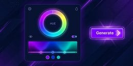
Generate CSS Gradients Instantly
Writing gradient syntax by hand is fast once you know the rules, but previewing dozens of color combinations in real time is where a gradient generator online saves real time. Instead of cycling through browser refreshes, you can drag color stops, adjust angles, and copy the final CSS in seconds.
If you need to convert a color from a design file before building your gradient, the HEX to RGB converter and the Color Picker are both useful starting points before you open the gradient builder.
Build Beautiful CSS Gradients Instantly
Free, no signup, works directly in your browser. Generate linear, radial, and conic gradients with live preview and copy-ready CSS output.
Try DevDeck's Color Tool Now →
Conclusion
CSS gradients replace image assets with pure code, giving you gradients that are resolution-independent, easy to update, and fast to load. Start with linear-gradient for directional transitions, use radial-gradient for spotlight and glow effects, and experiment with conic-gradient when you need pie-style or sweep patterns. Always include a solid color fallback, keep an eye on prefix requirements for text gradients, and use a live tool to speed up the design iteration cycle. With these building blocks in place, you have everything you need to replace static gradient images across your entire project.
CSS gradients are values of the background-image property, not background-color. This matters for fallbacks: a background-color rule placed before the gradient will show in browsers that do not support it, because background-image layers on top of background-color.
Yes. CSS allows multiple comma-separated background-image values. The first value in the list sits on top. This technique is commonly used to layer a semi-transparent gradient overlay on top of a photo background, keeping text readable without a separate HTML element.
Text gradients require both -webkit-background-clip: text and background-clip: text, plus -webkit-text-fill-color: transparent. Omitting the -webkit- prefixed versions causes the effect to fail in Safari and older Chromium-based browsers. Always include both declarations together.
Think of gradient angles like a clock: 0deg goes bottom to top, 90deg goes left to right, and 180deg goes top to bottom (same as the default to bottom). Using a live gradient generator online lets you drag an angle slider and see the result instantly, which is faster than manually editing code.
In most cases, yes. CSS gradients are rendered by the browser's graphics engine, require no HTTP request, and scale to any screen density without blurring. A PNG or JPEG gradient image adds file size, an extra network round-trip, and can appear soft on high-DPI displays. CSS is the preferred approach for simple color transitions.