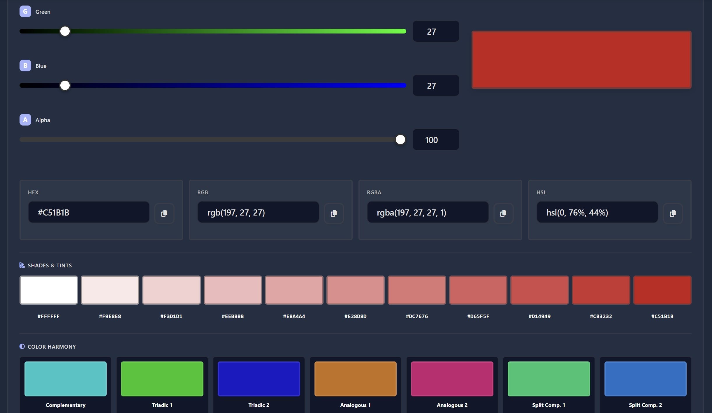
Finding the perfect colors for your web projects can be challenging, but a reliable color picker tool for developers makes the process much easier. Whether you're matching brand guidelines, recreating design mockups, or ensuring accessibility standards, having the right tools at your fingertips streamlines your workflow. This guide walks you through practical workflows using professional color tools that help you select, harmonize, and convert colors for seamless CSS implementation.

Extracting Colors from Brand Guidelines
Brand guidelines typically provide colors in various formats like HEX, RGB, or even CMYK. As a developer, you need to translate these specifications into working code quickly. The Color Picker lets you input any color format and immediately see how it appears on screen.
Start by entering the HEX code from your brand guidelines. The tool displays the color instantly, allowing you to verify it matches your expectations. You can then extract the exact values you need for your stylesheets. This workflow eliminates guesswork and ensures brand consistency across your entire project.
Matching Design Mockups Accurately
Design mockups often contain subtle color variations that are difficult to replicate by eye. Using a color picker, you can sample colors directly from design files or screenshots. The tool captures the precise values, which you can then test against different backgrounds to ensure they work in your actual implementation.
For developers working with design teams, this creates a shared reference point. When designers specify a color, you can validate it immediately and discuss any adjustments needed for web display. This collaborative approach reduces revision cycles and speeds up development time.
Creating Accessible Color Combinations
Accessibility isn't optional in modern web development. The Web Content Accessibility Guidelines (WCAG) specify minimum contrast ratios between text and background colors. Meeting these standards ensures your content remains readable for users with visual impairments.
WCAG defines two conformance levels for contrast ratios. Level AA requires a minimum ratio of 4.5:1 for normal text and 3:1 for large text. Level AAA sets higher standards at 7:1 for normal text and 4.5:1 for large text. These ratios determine whether your color choices provide sufficient visibility.
WCAG Contrast Ratio Examples:
- Black text (#000000) on white background (#FFFFFF): 21:1 (passes AAA)
- Dark gray text (#595959) on white background: 7:1 (passes AAA for normal text)
- Medium gray text (#767676) on white background: 4.5:1 (passes AA for normal text)
- Light gray text (#959595) on white background: 2.8:1 (fails both AA and AAA)
When selecting colors for your project, always verify contrast ratios before finalizing your choices. A color picker tool helps you test different combinations quickly, showing you which pairings meet accessibility standards and which need adjustment.
Testing Color Contrast in Real Time
Rather than coding first and testing later, use your color picker to validate contrast before writing CSS. Input your foreground and background colors, then check the calculated ratio. If it falls short of WCAG standards, adjust the lightness or darkness of one color until you achieve compliance.
This proactive approach saves debugging time later. You avoid the frustration of discovering accessibility issues during QA testing or after deployment. Building accessibility into your color selection workflow creates better experiences for all users.
Understanding Color Harmony and Exploration
Choosing colors that work well together requires understanding color theory principles. The Color Explorer demonstrates various harmony rules that guide professional color selection. These rules are based on the relationships between colors on the color wheel.

Complementary colors sit opposite each other on the color wheel, creating high contrast and vibrant combinations. Analogous colors appear next to each other, producing harmonious and calming palettes. Triadic schemes use three colors evenly spaced around the wheel, offering balanced variety without overwhelming the eye.
The Color Explorer generates these schemes automatically from any base color. Pick your primary brand color, then explore complementary, analogous, triadic, and split-complementary options. This feature helps you build complete color palettes that maintain visual coherence across your interface.
Building Practical Color Palettes
Professional websites typically use a limited palette: one or two primary colors, a few accent colors, and neutral tones for backgrounds and text. Start with your main brand color in the Color Explorer, then select a harmony rule that fits your design goals.
For corporate sites, analogous schemes create professional, cohesive looks. For creative projects or calls-to-action, complementary schemes add energy and draw attention. Triadic schemes work well when you need more variety while maintaining balance. The tool shows you all options, letting you compare them side by side.
Converting Colors for CSS Implementation
After selecting your perfect colors, you need to implement them in your stylesheets. Different CSS properties accept different color formats. The HEX to RGB converter transforms your picked colors into the format you need for your specific use case.
HEX codes work well for solid colors in CSS. However, when you need transparency or want to manipulate color channels dynamically, RGB or RGBA formats provide more flexibility. Converting between formats ensures you can use your colors however your project requires.
For example, you might pick a color as #3498db and need to apply it with 50% opacity. Convert it to RGB (52, 152, 219), then use rgba(52, 152, 219, 0.5) in your CSS. This workflow lets you maintain consistent colors while adjusting transparency for overlays, shadows, or hover effects.
Key Takeaways:
- Use color pickers to extract exact values from brand guidelines and design mockups
- Always verify WCAG contrast ratios to ensure accessible color combinations
- Apply color harmony rules to build cohesive, professional palettes
- Convert colors to appropriate formats (HEX, RGB, RGBA) for specific CSS needs
Conclusion
A professional color picker tool for developers transforms color selection from guesswork into a systematic workflow. By extracting colors accurately, ensuring accessibility compliance, exploring harmonious combinations, and converting formats seamlessly, you create better designs faster. These tools integrate color theory and practical functionality, helping you make informed decisions that improve both aesthetics and usability. Whether you're building a new project or refining an existing one, mastering these workflows elevates your development process and delivers superior results for your users.
FAQ
Use HEX codes for solid colors as they're compact and widely supported. Choose RGB or RGBA when you need transparency or plan to manipulate color values with JavaScript. HSL formats work well when you want to adjust lightness or saturation programmatically. Modern browsers support all formats, so pick based on your specific needs.
Calculate the contrast ratio between your text and background colors. For WCAG AA compliance, normal text needs at least 4.5:1 and large text needs 3:1. For stricter AAA standards, aim for 7:1 and 4.5:1 respectively. Use color picker tools that display contrast ratios automatically, or test your live pages with accessibility checkers.
If you have the original design files, use your design software's built-in color picker to get exact values. For images or screenshots, use a browser-based color picker tool or a desktop eyedropper utility. Always verify the extracted colors on your actual background to ensure they appear as intended, since display settings can affect how colors look.
Most professional websites use 3-5 main colors: one or two primary brand colors, one or two accent colors for calls-to-action, and neutral tones for backgrounds and text. Too many colors create visual chaos, while too few limit your design options. Start with a base color, then use color harmony rules to select complementary options that work together cohesively.
While you can maintain brand colors across themes, you'll need to adjust their lightness and contrast ratios. Colors that work on white backgrounds often fail accessibility standards on dark backgrounds. Create separate variations of your palette for each theme, testing contrast ratios for both. Use CSS custom properties to switch between theme-specific color values easily.
